A few weeks back I saw someone type /explodedview /xray into an image prompt and get back a Flutter app pulled apart like a Haynes repair manual. My first thought was that I had missed a product launch.
I had not. These are not official commands. No AI tool ships a /blueprint button, and there is no secret prompt language. They are visual shorthand. Words like exploded view, cutaway and isometric already name well-known drawing styles, and putting a slash in front simply makes them short, memorable and easy to stack. The model reads them as plain English. The slash is for you, not for it.
For an architect, that turns out to be quite useful. Compare this:
Draw me a nice diagram of a Flutter app showing what is inside it.
with this:
/explodedview /xray /annotated
Flutter mobile application
The first one gets you clip art with arrows. The second sets the whole visual language in one line.
This page is a cheat sheet. Mostly I come back here to copy things, and you are welcome to do the same.
About twenty words in five groups
You do not need fifty pseudo-commands. You need roughly twenty, sorted by the job they do.
Structure (how to break the subject apart)
| Tag | Use it to |
|---|---|
/explodedview | Pull a system apart into its major components |
/layers | Separate the architecture into stacked logical layers |
/componentmap | Decompose a product into capabilities or components |
/crosssection | Slice through something to expose its internal structure |
/pipeline | Show sequential stages from input to output |
View (where the camera sits)
| Tag | Use it to |
|---|---|
/xray | Reveal internals while keeping the outer shell visible |
/cutaway | Remove part of the exterior to show what is inside |
/isometric | Give platforms and cloud systems 3D spatial depth |
/ghosted | Fade outer structures so the inner ones stand out |
/detailview | Zoom into one component that matters most |
Relationship (who connects to whom)
| Tag | Use it to |
|---|---|
/systemdiagram | Show components, boundaries and relationships |
/sequence | Show interactions between actors in strict order |
/topology | Show infrastructure or the service landscape |
/userflow | Show user movement through screens and services |
Communication (what the viewer should take away)
| Tag | Use it to |
|---|---|
/infographic | Turn the subject into an explanatory visual |
/annotated | Add labels and short callouts |
/explainer | Optimise for teaching a concept |
/comparison | Put options or states side by side |
/roadmap | Show stages or evolution over time |
Style (the look and feel)
| Tag | Use it to |
|---|---|
/blueprint | Engineering documentation aesthetic |
/technical | Precise, documentation-grade visual |
/minimal | Strip out noise for executives |
/handdrawn | Whiteboard sketch feel |
/wireframe | Structural UI skeleton |
Pick two or three, then tell the truth
The method is simple. Take one tag from two or three different groups, then describe the actual architecture in plain words.
/layers /isometric /annotated
means: show me the layers, give them depth, and explain the important pieces.
/sequence /technical /annotated
means: forget the pretty platform picture, show me exactly who talks to whom and in what order.
Same subject, completely different question answered. That is the whole trick.
But the tags only set the look. The facts have to come from you. A good prompt always has two halves:
/explodedview /xray /annotated /infographic

Flutter mobile application.

Show these layers, top to bottom:
- Flutter UI and widgets
- Dart application and business logic
- Flutter framework
- Flutter engine
- Platform channels
- Native Android and iOS modules
- Operating system services
- Device hardware

Keep enough of the phone visible to show how the layers fit together.
Label every layer. Show interaction only between adjacent layers.
Audience: product architects and developers.
Visual language on top. Architectural content below. Do not skip the second half.
Here is what came back:
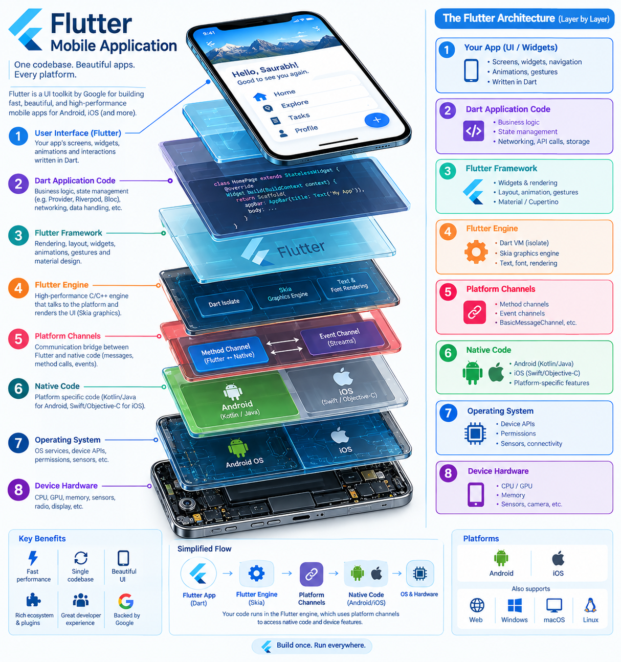
Honestly, I was impressed. Eight layers, in the right order, each labelled, with the phone still visible on top so you know what you are looking at. That is a slide I would have spent an afternoon on.
But look closely and you will see the model doing what models do. I asked for layers. It also gave me a “Key Benefits” panel, a “Backed by Google” badge and a “Build once. Run everywhere.” banner. Nobody asked for the marketing department, but it turned up anyway, uninvited, like a cousin at a wedding. Which brings me to the trap.
/blueprint can make nonsense look official
It is an obvious one once said out loud.
/blueprint makes everything look authoritative, including things that are wrong. /infographic makes an invented relationship look convincing. /explodedview will happily place your API gateway somewhere near the phone battery and label it beautifully. Image models love adding a Kafka cluster because it looks architectural. Nobody asked for the Kafka cluster.
So the model does the drawing, and I do the architecture. If a relationship is not in my prompt, I tell the model not to imply one.
One more lever that often beats adding another tag: ask for visual hierarchy. AI diagrams treat every box as equally important. Real architecture diagrams never do. Lines like these help a lot:
Make the runtime request path visually dominant.
Keep infrastructure detail secondary.
Show the trust boundary clearly.
Separate control plane from data plane.
Separate ingestion-time from query-time.
Group components by ownership.
Show only architecturally significant relationships.
Quick picks
When I know the question, this is the shortcut.
| The question | Try |
|---|---|
| What is inside it? | /explodedview /xray /annotated |
| What are the layers? | /layers /isometric /annotated |
| What connects to what? | /systemdiagram /annotated /infographic |
| Who calls whom, in what order? | /sequence /technical /annotated |
| How does data move through it? | /pipeline /infographic /annotated |
| What does the service landscape look like? | /topology /systemdiagram /technical |
| How do two options differ? | /comparison /technical /infographic |
| How do we get from current to target? | /comparison /roadmap /annotated |
| How does the user move through it? | /wireframe /userflow /annotated |
| Can an executive get it in 30 seconds? | /isometric /infographic /minimal |
| Deep technical internals, please | /cutaway /blueprint /technical |
And when in doubt: /isometric /infographic /annotated, then describe the architecture properly. That is the 80/20 of this whole page.
Let the AI choose the combination
Here is the real shift. You do not need to remember which tag to use. You only need to remember this page exists, and let the model do the choosing.
The prompts below give the AI the vocabulary as a menu, not a rulebook. It picks what fits, explains why, and hands back a ready image prompt. Three sizes, depending on how much time you have.
The one-liner
For when the AI already understands the architecture from earlier in the conversation.
Using visual prompt tags like /explodedview, /xray, /cutaway, /layers, /isometric, /systemdiagram, /sequence, /pipeline, /topology, /comparison, /infographic, /annotated, /blueprint and /minimal as a menu, choose the 2 to 4 that best explain this, tell me why in one line, then write the complete image prompt. Do not invent architecture details.
The everyday version
Act as my visual architecture prompt designer.

I want to visualise: [DESCRIBE IT HERE]
Audience: [WHO WILL SEE IT]

Treat these visual tags as a menu, not a checklist:
Structure: /explodedview /layers /componentmap /crosssection /pipeline
View: /xray /cutaway /isometric /ghosted /detailview
Relationship: /systemdiagram /sequence /topology /userflow
Communication: /infographic /annotated /explainer /comparison /roadmap
Style: /blueprint /technical /minimal /handdrawn /wireframe

Choose the 2 to 4 tags that best communicate what I am trying to show.
Fewer is better. Do not use a tag just because it is available.

Return:
1. The combination you chose
2. One short paragraph on why it suits this subject and audience
3. A complete, copy-paste image prompt describing the components,
   relationships, visual hierarchy and labels explicitly
4. One alternative combination, only if it would reveal something
   meaningfully different

Do not invent components, flows or protocols. Ask me for a missing
detail only if technical correctness depends on it.
The full version, with guardrails
For architecture that will end up in front of a design authority, where a pretty wrong picture costs more than an ugly right one.
You are my visual architecture prompt designer.

I will describe a system, product, process or decision I want to explain
visually. Your job is to work out what I am really trying to communicate,
choose the visual treatment that explains it best, and write the image
prompt.

VISUAL MENU (descriptive keywords, not official commands)
Structure: /explodedview /layers /componentmap /crosssection /pipeline
View: /xray /cutaway /isometric /orthographic /ghosted /detailview
Relationship: /systemdiagram /sequence /topology /userflow /journey
Communication: /infographic /annotated /explainer /comparison /roadmap /timeline
Style: /blueprint /technical /schematic /minimal /handdrawn /wireframe /flat /3d

HOW TO CHOOSE
Start from the question being answered, not from the keywords.
"What is inside it" suggests structure and view tags.
"Who talks to whom, and when" suggests a sequence over a platform picture.
"Which option" or "how do we get there" suggests comparison or roadmap.
Executive audiences want less detail. Technical audiences want precision
over drama. Usually 2 to 4 tags beat 8. You may pick a combination I
have not anticipated if it genuinely fits better.

ARCHITECTURE RULES
- Use only the components and relationships I describe.
- Do not invent services, data flows, protocols, security controls or
  dependencies. If a relationship is not stated, do not imply it.
- Distinguish logical architecture from deployment architecture.
- Preserve trust and security boundaries where they matter.
- Use arrows only for real requests, responses, data flows or trust.
- Make the most important flow or concept visually dominant; keep
  secondary detail visually subordinate.
- Group components by layer, ownership, trust boundary or
  responsibility, whichever serves the message.

RETURN
Recommended tags: the combination you chose
Why: one short paragraph
Image prompt: complete and copy-paste ready, including tags, subject,
components, relationships, hierarchy, labels, audience and accuracy
constraints
Alternative: one other combination and what it would reveal, only if
it adds something real
Questions: only those I must answer for technical correctness

Here is what I want to visualise:
[PASTE YOUR ARCHITECTURE, SYSTEM, PROCESS OR IDEA HERE]
The pen got faster, the thinking is still ours
Architects have always drawn pictures. Whiteboards, napkins, that one Visio diagram everybody is scared to open because it has 400 shapes and nobody knows who made it. The drawing was always the slow part, so we drew less than we should have.
That excuse is gone now. An exploded view of your platform costs a minute and a well-chosen sentence. What it cannot do is decide what your platform actually is. That part was never the drawing, and it was never going to be the AI’s job either.
So pick two tags, describe the truth, and go draw the thing you have been explaining with your hands in meetings for three years. Your stakeholders will finally see what you have been seeing all along.
Written for KiwiGPT.co.nz · Generated, Published and Tinkered with AI by a Kiwi